Thursday, 10 February 2011

Experimenting with positioning the final piece

For my final piece, I have decided which pictures I would like to incorporate in the final collage. I then printed them off and rearranged them in several ways. These are the images that I would like to use in my final piece.

In this layout, I quite like the colour scheme that is made quite apparent with the arrangement of the images. The light brown hues evident from the picture of the coffe cup, and the picture of the knife and fork, are placed right next to each other, whilst the dark pictures including more of a dark brown tone are lined together also. Creating quite a barrier and pattern scheme within the colours.

I placed the biggest sized picture above all the other smaller ones to give the final piece an appeal of a newspaper because this is the layout that they usually conform to in newspapers.

I rearranged these pictures to look as though they were bricks in a wall, the spacing is small, smiliar to the pattern of bricks in a wall. i thought this was quite an interesting technique as bricks are usually brown and tones of brown are prominent within these images. This is quite an unusual approach to rearranging my images.

Tuesday, 8 February 2011

More cafes


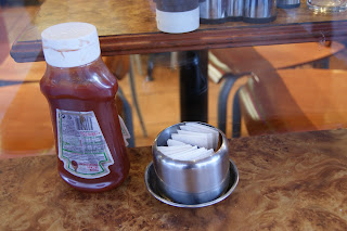
A high angle shot is used in this image to make the ketchup bottle and the silver container appear  smaller than their actual size to focus on the form of the objects. The high angle shot also allows the viewer to make a comparison between the table and the objects.


I used a low angle shot of this image to make the ketchup bottle appear more prominent within the image. The prominence is also emphasized by how the object is in focus in comparison to the depth of field incorporated. A close up also allows to viewer to focus on the detailing of the bottle.


I used an extreme close up to capture the force and knife to emphasize the significance of the two items whilst placing focus on the detailing of the two items of cutlery


I used a high angle shot in this image to ensure that
both the fork and knife were visible in this image as I thought that these two items of cutlery are heavily associated with food - a theme that encompasses the notion of the "everyday" which also channels the style of Stephen Shore. I also like how they are placed along the line of the napkin and it emphasizes the strong use of line in the image.

Similarly to the picture above, I used a high angle
shot to capture the knife and fork, however I
preferred the previous image as the subject of the
image was placed slightly off centre to create a sort
of empty space which I find aesthetically pleasing
because of the lack of generic balance in the picture.
In these two images, I experimented with the angles of the forks on the table by alternating the direction of the lines in the images. In this picture, i wanted to simulate a notion of continuity by capturing the image using a more straighter line and also by cutting of half the image. The forks decreasing in size also creates a focal point.
I slanted the angle in this picture to create a diagonal lines to create a geometric shapes within the image. There are several triangles in this photograph which can be seen in the breaking points of the edges of the table in particular. The theme of these geometric shapes is also heightened by the triangular napkins on the table.

La roma caffe

This picture establishes the location of where these images have been captured. I used a wide shot to attempt to fit the entire image of the cafe into the frame. However, a car unfortunately blocked part of the image, which diverts the focus slightly on the moving image, despite being in less focus than the cafe. The lighting in this picture is also very bright, I made use of the ambient natuyral lighting, from the daylight, therefore incorporating a flash on the camera was not neccessary.
This picture was added as it helps set the atmosphere of a cafe, it is also an everyday item because I see these signs outside cafes on a daily basis.
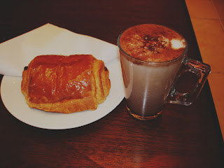
In this picture, I like how the cup is in focus whilst the background is not, therefore leading the viewer's focal point to the cup rather than the background. it places more emphasis and significance to that particular item. However, I could have improved this image by also incorporating the rest of the plate in the image, rather than just cutting it off the frame.
I used a high angle shot to capture this cup of coffee because I wanted to experiment with the different angles of the same object to see which one I could use for my final piece. I also used a close up to emphasize the detailing of the sprinkles on the coffee, whilst the closeness of the shot indicates the significance of the item. I also used a high angle shot because I wanted to focus on the sprinkles and the froth, instead of the coffee mug.
This photo appears slightly blurry and out of focus. I also dislike how the top of the ketchup bottle has been cut off the image, as it would have been more aesthetically pleasing to capture the whole object without cutting parts out of the picture.

The composition of the ketchup bottle and the salt in this picture is centered to emphasize the significance of the two items. It is also the focal point in the image as the spot light leads the viewer's focus to the items. I also like the simplicity within the colour shcene of this image. the colour borwn is very prominent which contrasts with the colour white from the salt and ketchup lid. These muted oak colours connote feelings of warmth and posseses an antique quality that Stephen Shore tends to incoporate within his photography.


I used a close up, eye level shot in this image. This differed from the pervious images because i used a lot of high angle shots to diminish the importance of the subject of the image. However this eye level angle shows subjects as we would expect to see them in real life, therefore seeing this ketchup bottle and salt how we would in reality. Furthermore, to avoid the problem of unintentionally cutting parts of the object out of the frame, i used a portrait shot as the objects/subject of the image is quite long.


Monday, 7 February 2011

Using photoscape to manipulate the effect in the images

Part of my final piece is to emulate the kitsch style in Stephen shore's images, and to simulate that same connotation of the past. Therefore I chose to use the program "photoscape" to help me achieve this effect in my images. The program photo scape manipulates the saturation, hue, brightness levels and contrast of various different images.
First I opened up "photoscape" and chosen the document where my designated image was located in.

I then chose my image.


Here, you can see that I played around with the different options avbailable. However, the measurements for each option varies on different pictures. There is no set requirements of the amount of brightness etc to achieve the appeal of my intention. After, I cliked ok.


Before
After

Altering my final piece

Earlier, I intended to construct my final piece from images based in the same cafe, however, it suddenly occured to me that it would be more beneficial if I incorporated images from different cafes in order to have a variation of food. For example, in some cafe's I only have images of drinks, however in other cafe's, I captured photo's of meals and plates, therefore I figured it would be quite a good idea to combine these images together in my final piece.

Experimenting at home

I wanted to simulate the atnospehere of a cafe, therefore I got a ketchup bottle, a cup, and a jar of nutella - iconography which is typically associated with food and cafes, and then experimented with various different shot sizes and angles. By doing so, it allowed me to broaden what types of pictures I take, which was like more practise of how to use a camera.

The angle I used in this picture created a pattern of concentric circles which was quite an interesting concept as I have never seen a cup in this perspective. I also like how the rings in the picture decrease in size which leads the viewer's eye to a focal point which is the centre of the image in this picture. This form in this 


Before my camera battery died


Selfridges window display


Whilst walking past selfridges, I noticed the window display depicted a family of rabbits having their breakfast. This appealed to me in particular as I believe it relates to the "everyday" because I think the notion of eating your breakfast is strongly associated with this theme. The idea of photographing meals (despite being artificial) also relates to the artist who is my inspirtation for my final piece - Stephen Shore. Stephen Shore's images are prodominantly based around food, therefore I thought that these series of images below are similar to Stephen Shore's concept.

Despite using a flash on my camera, the lighting in this image appears very unexposed, due to the light source from the camera reflecting on the window. Therefore, in this situation, I believe it was more beneficial to remove the flash from the camera, and to capture the image using the ambient light instead.